Wednesday 15 May 2013

Art Book

Once I had created the motion graphic, I started on making the layout for the Art Book.


I decided to introduce the book with the narrative from my motion graphic, and use it as a starting point to introduce the two characters.


I then created pages that showed off all of my development work, explaining specific mile stones along the way. I then ended the book with the illustrations I created.


Final Motion Graphic

I continued to make changes to The Children of Wailing Wood motion graphic until I felt the timing was perfect. I am really happy with the overall flow and how it fits in with the music I added.

Friday 10 May 2013

Motion Graphic Finishing Touches

Since the previous creation of the motion graphic, I have created an opening title scene and credits.

I used the title from my design document from Ba7 and incorporated some animation by adding layers of the corner trees to create the effect of growing branches. I used the same effect in the ending credits, which I used to credit the music and texture I used.

I also spent a lot of time making more tweaks and slight changes to improve the whole animation.


Tuesday 7 May 2013

Further Illustrations

I felt that the weapon I designed needed some more explaining and I wanted to create an illustration to show it in use, as well as create more illustrations of my characters.

Initial Sketch and base colour:


Wanted to take the image further so added shading and more detail, such as the dreads and hair accessories:


Added a background using a photo I took at Wayland wood and added a texture.


I liked the image but felt she didn't stand out enough so played around with colours and lighting to enhance it.


After completing this illustration, I decided to create a counter illustration of the brother using the weapon in a  different way, such as a spear.


I then took the two images and played around with their compositions and how they could work with each other.


Group Crit Changes

I also showed my fellow students and tutor my other art work I have been working on, such as my model sheets and recent illustrations. The feedback I received was mostly positive with just a few tweaks and changes to improve my work. These are the images I changed and improved on:


The three-quarter perspectives on both the Brother and Sister model sheets were slightly off, so I have altered they're stance and shaded them it to stop them from looking so flat.


I also revisited this illustration of the Brother character, taking more time with the shading and playing around with lighting. I was trying to recreate the image of light coming through the tree tops/

Motion Graphic Development

After piecing all of the separate videos of my motion graphic together, I ended up with this


I then took this video into my group crit to receive feedback on what others thought.

The biggest problem was the speed and flow: this rendition moves far to quick and the pacing is off. As well as this, I was given other pointers for things I should change to improve the overall video.

Things to change:

- Darken Kids on Trees faces
- Change guy to be on same side as previous (panel 20)
- Slow down the whole tempo
- 1-2 blend in transitions
- 3 slow down curtain and blend in
- pause end of panel 6 longer
- move texture up on 6
- Panel 9, narration needs to come in sooner
- Longer between panel 10 and 11
- Longer Pause between 13-14
- Make panel 16 last a lot longer
- Stop the bounce on panel 17
- Change transition on 17/18 (both same)
- Slow down text scenes a lot
- Panel 21, need to move back man
- Move man up as walking away 27 and darken
- 29 fade faces/darken
- 29 change animation, moves weird
- SLOW DOWN OVERALL TIMING
- Add Ambient music

After taking these into consideration, I went back and made all of these changes as well as a few others

Insert second video

I carried on this process at least 5 more times, making changes, rendering out the video, watching it back and taking notes of things to change.

So far this is the video I have, I have slowed down the pace a lot and added some ambient music.


Tuesday 30 April 2013

Outside Work

Earlier this year, I also entered a competition set by Aphelio, a bold games and interactive design company, challenging competitors to create designs for characters, creatures or environments a game design they are beginning work on. We were given a short brief for what they were looking for and this is what I ended up designing. These creature designs were both exciting and difficult for me as I have never tried to design creatures before. Some designs came simply out of my imagination, like the Peryton Deer design, while others I really focused on their background and why they look the way they do, such as the Whaitiri Glider, which turned out to be my favourite design. I gave them all names and short pieces of information to show I had thought about what each creature would be like and not simply focused on the aesthetics.


 After being invited to join the team for this project as part of a group of interns, I then went on to create some character designs.

This first image was my first design I liked, but I didn't want to get stuck into one character design so I created some thumbnails, exploring different shapes and sizes.


These are the characters I developed from my thumbnails, as you can see I tried to explore as many different designs as possible, from old women to young children to spirit type characters. 


These are a few different head designs.


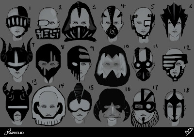
And currently I am working on different clothing, focusing on helmets and masks 


Initial Designs

Developed Helmet Designs 


Sunday 28 April 2013

Character Illustrations


This is an illustration I created of Sister just sitting in a tree to represent her closeness to nature.


I realised the head was too big so shrunk it down and neatened up the colouring.


I then played around with different layers and tried to create the look of light shining through the tree tops. I also made separate layers to show her blinking, I would like to add some movement to these images for my show reel.


I then went back and neatened the line work up, added in her hair accessories and developed the colour and this is what I currently have. 


Brother Illustration

This is the initail sketch, I wanted to show the siblings relaxed and calm amongst nature as a contrast to their wild hunter sides. Initially I had a bird sitting in the boys hand but opted for a red squirrel instead.


I drew over my sketch, loosely coloured the in the base and added a similar effect to the sisters to create the lighting effect. 


After looking back, I felt there was something wrong with the head and I didn't like the re-drawn face, so I cleaned up the original sketch of the face and enlarged it. I have begun to add shading to add depth.